Decorating Your Home For Future Buyers? Don’t Let Colour Cloud Your Thinking
HOMEOWNERS are often told to redecorate their house before they try to sell it by giving it a fresh coat of paint or a new roll of wallpaper.
But although it can help add value to a property – there is one thing you should never let colour your judgement: the shades you go for.
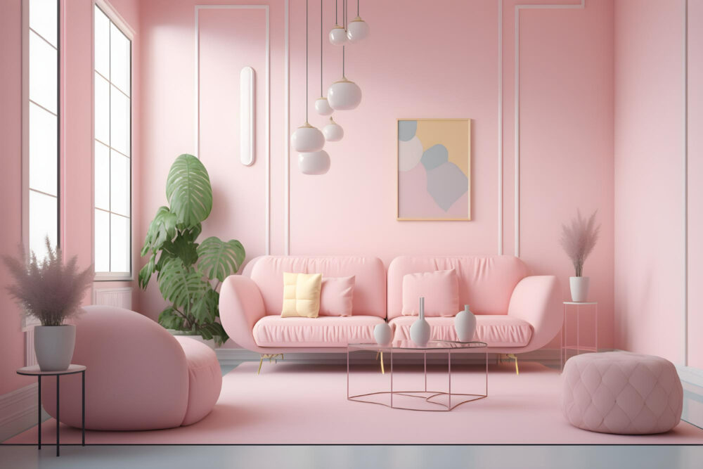
Opting for garish and standout colours might help you stand out, but it could backfire – so leave those pinks for the Barbie franchise not for the prospective bidders.
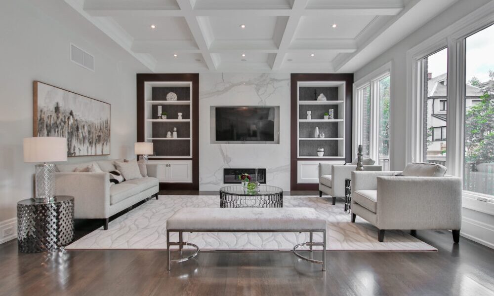
Instead, choose a neutral as this is likely to make it more appealing to future buyers.
Klara Painter, from House Buy Fast, said: “Colours have the power to change how we feel. Surrounding ourselves with vibrant hues can release dopamine, the feel-good hormone. But if you go too garish it can really put people off. To make sure the result is not an eyesore use a colour wheel. It’s a valuable tool in colour theory and it always works.”
Here are some basic rules you can follow:
Monochromatic Harmony:
Explore different shades or tints from the same colour group. E.g. various blues. This way you will create a monochromatic interior that is calm and elegant. It’s a foolproof rule that guarantees a harmonious look.
Adjacent Colours:
Select colours from neighbouring groups on the colour wheel. E.g. yellow, yellow-green, and green. By doing so, you can infuse your room with an array of vibrant and balanced colours.
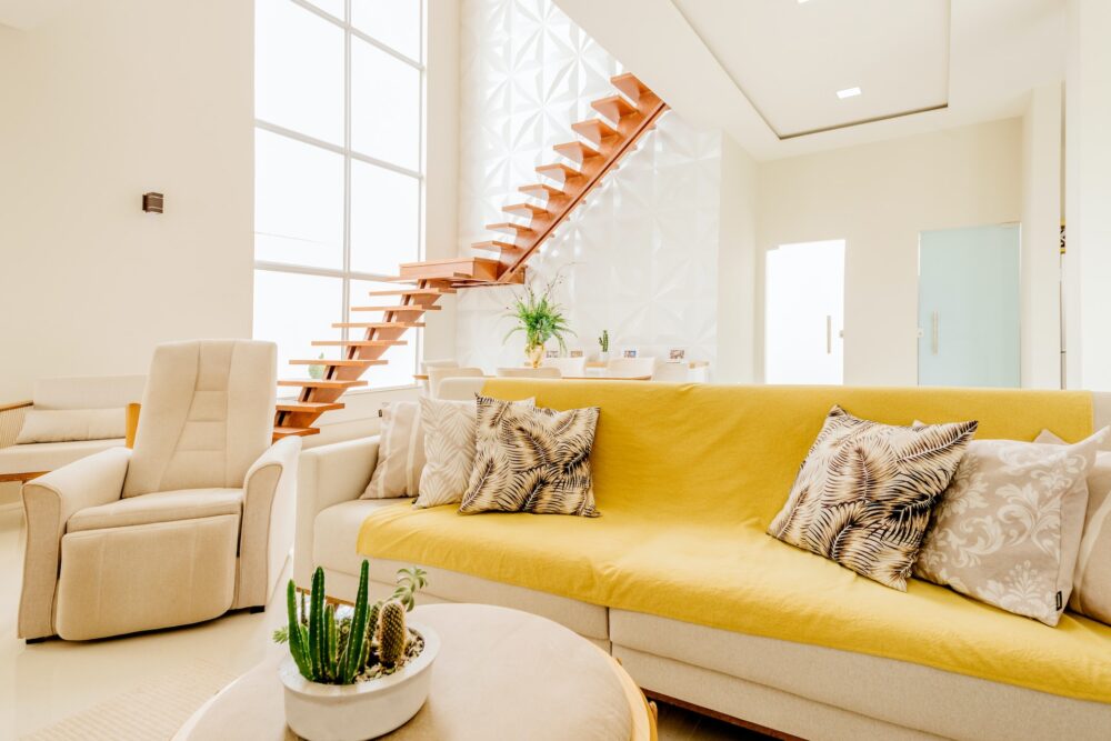
Complementary Contrast:
Experiment with complementary colours. You will find them opposite each other on the colour wheel, such as yellow and purple. This daring combination can create a bold and intriguing effect. And will add a wow factor to your space. Before you decide on a colour, give it a test run. You can do this by using a sample pot and painting a small area of lining paper with different shades. It helps you see how you like it before making a final decision.
Shop Around
If you already have a specific colour in mind, many DIY shops can help you out. They offer a colour matching service where they can mix the exact shade you want in the finish you prefer. So you can get the perfect paint for your project.
And finally:
Remember, there’s one more rule: Break the rules! Your home is for you, and it should be a place where you feel good and comfortable. If your initial colour choices don’t work out as expected, don’t worry. You can always paint over them and start again.